The challenge
Core problem
Big social justice issues (climate change, inequality, systemic racism) overwhelm high school students. Traditional civic education makes these problems feel too abstract, or too big to fix. That breeds apathy instead of engagement. Students learn about the issues but never find a path to doing anything about them.
The opportunity
Build a learning experience that makes complex issues simpler to grasp without flattening the truth, and that moves students from just knowing about a problem to actually responding to it. Ground it in service learning theory: pair critical thinking with hands-on community service so the learning sticks.
Key design challenges
- Break abstract, emotionally charged topics into pieces students can actually handle
- Build a thinking process that stops students falling into us-vs-them thinking
- Create a visual identity that feels young and energizing, not institutional or preachy
- Let students genuinely learn from and connect with each other
- Bridge what they learn in class to real action in the world
The process
Research & analysis
Context: I co-founded this education startup in 2019 with a colleague who had run a lot of social justice programs in schools. We’d both seen the same thing: students care about these issues emotionally, but they don’t have a way to think them through or act on them.
Learner needs identified:
- Students wanted to “make a difference” but felt frozen by how big the problems were
- The resources out there were either too academic (dense policy reports) or too shallow (sign this petition!)
- Talking it through with peers mattered a lot. Students needed to work through hard topics together, not alone
- The look mattered too. Gen Z responds to imagery and design, not walls of text
Core insight:
The best social justice educators don’t hand students answers. They teach a process for thinking through complexity. That became our “See, Think, Act” framework.
Design approach
The See-Think-Act framework
My cofounder and I designed a three-stage thinking process, and it became the foundation of how we taught:
- See: Look at the issue from several angles, not just your gut reaction
- Think: Dig into the root causes, who’s affected, the trade-offs, and the consequences
- Act: Design your own response, based on your values and what you can actually do
The framework did two things:
- Cognitive scaffolding: it stops students getting overwhelmed by breaking a big problem into stages they can handle
- Agency building: students come up with their own responses instead of being handed a solution
Visual identity as learning tool
I worked closely with one of Australia’s leading creative designers to build a visual identity that would:
- Feel vibrant and made for young people, not academic or corporate
- Send a message of energy and possibility, not doom and despair
- Be instantly recognizable everywhere the brand showed up
- Make dense content feel approachable through clear visual hierarchy
The collage and logo were our two core assets, and everything else grew out of them. The colors were a deliberate choice: warm oranges and purples for energy and creativity, balanced with clean, professional type.
Development & iteration
Initial approach: In-person programming and book development
In 2019 we started building a book and in-person programs to run directly in schools. The plan was face-to-face workshops where students would dig into social justice content through discussion and hands-on activities.
Forced pivot (2020-2021): Pandemic response
When Victoria went into extended remote learning (nearly two years), in-person school visits were off the table. We had to rethink how we delivered the whole thing.
Exploration phase: Async vs. sync learning
We looked at both options:
- Asynchronous: self-paced video lessons with knowledge checks students do on their own
- Synchronous: live, cohort-based sessions that keep students interacting with each other
Critical decision (Early 2021): Synchronous cohort model
We chose the synchronous (live) approach because this kind of learning is socially constructed. Students need to talk through their thinking with peers, challenge each other’s assumptions, and build their responses together. Going live kept our original in-person vision alive while working within remote constraints.
Final design: 4-week live course
- Week 1-4: a 90-minute Zoom session each week, with cohorts of 15-20 students
- Between sessions: hands-on projects at school with peers (the service-learning part)
- Ongoing: a private Mighty Networks social platform for keeping the conversation going
This kept us true to social constructivist learning theory: we build understanding through language and interaction, not by passively taking it in.
Visual design implementation
Created comprehensive visual system:
- Presentation slides: Consistent templates with strong visual hierarchy, limited text, powerful imagery
- Course materials: Student workbooks and teacher guides with cohesive branding
- Social media content: Instagram posts that translated complex concepts into shareable graphics
- Video content: Instructional videos with animated graphics and on-brand styling
- Platform design: Mighty Networks customization matching overall visual identity
Testing & refinement
Feedback from pilot cohorts:
- Students reported feeling “less overwhelmed” by the See-Think-Act structure
- Teachers appreciated the balance of structure (framework) and flexibility (student-designed responses)
Adjustments implemented:
- Shortened Zoom sessions from 2 hours to 90 minutes (attention spans)
- Added more breakout room time (peer-to-peer processing)
The solution
What students experienced
Students joined a 4-week cohort alongside peers from several schools. Each week tackled a different social justice issue (climate justice, economic inequality, and so on) using the See-Think-Act framework.
Weekly flow:
- Zoom session: a facilitator-led discussion, with breakout rooms so students could work through it in small groups
- School-based project: design and carry out a response to that week’s issue (a school campaign, a community event, a creative project)
- Social platform: share progress, get feedback from peers, and grab extra resources
Example: See-Think-Act in action
Issue: Fast fashion and labor exploitation
- See: Students examined multiple perspectives: consumers, garment workers, fashion executives, environmental advocates
- Think: Analyzed root causes (consumer demand, supply chain complexity, regulatory gaps) and trade-offs (cheap clothing vs. living wages)
- Act: Students designed varied responses based on their values:
- School clothing swap event
- Social media campaign educating peers
- Letter-writing campaign to fashion brands
- Personal commitment to secondhand shopping
The framework made room for all kinds of responses. There was no single “right” answer, just thoughtful action that lined up with each student’s values.
Visual identity showcase
The design challenge was to turn the abstract ‘See, Think, Act’ process into something you could see and touch. We needed an identity that felt urgent but organized, sitting between the messiness of social advocacy and the clarity that education demands.
The visual language we landed on mixes clean geometric shapes with warmer, more human textures. It stands out, and it guides students through their learning.
Logo
The main logo holds the whole identity together. It forms a forward-pointing arrow out of three geometric tiers, a direct nod to ‘See, Think, Act’. We paired the icon with a custom sans-serif wordmark that uses heavier and lighter weights for readability, giving it a clean, modern hierarchy that carries through everywhere the brand appears.
Logo reveal and sonic identity
The animation pulls apart the ‘3stepsaway’ name and stacks three geometric segments (indigo, orange, and teal) into a forward-pointing arrow. Seen from above, the logo also looks like the steps of a spiral staircase. The build is timed to a bright, rising three-note sound, so the visuals and audio together read as momentum and distinct stages of progress.
Core brand collage
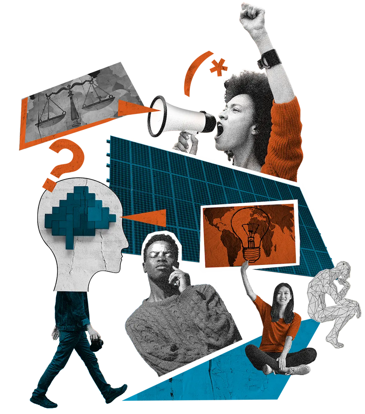
This hero collage builds on the logo’s clean geometry and turns the brand into a human story, using a mixed-media ‘cut-out’ look. We pulled together imagery of advocacy, strategy, and innovation in the brand’s colors. The result feels organic and textured while keeping the diagonal momentum of the logo.
Course materials
This course outline applies the identity to information design. It captures the ‘See, Think, Act’ method using the three brand colors so each stage is easy to tell apart. The layout turns the idea of momentum into a vertical timeline, with a natural flow through the learning journey and clear, digestible milestones along the way.
Presentation design
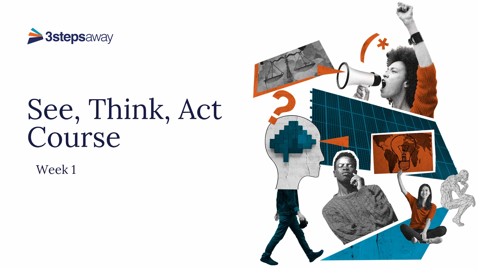
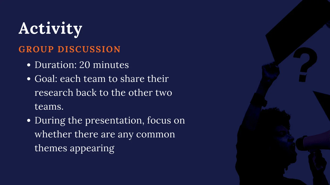
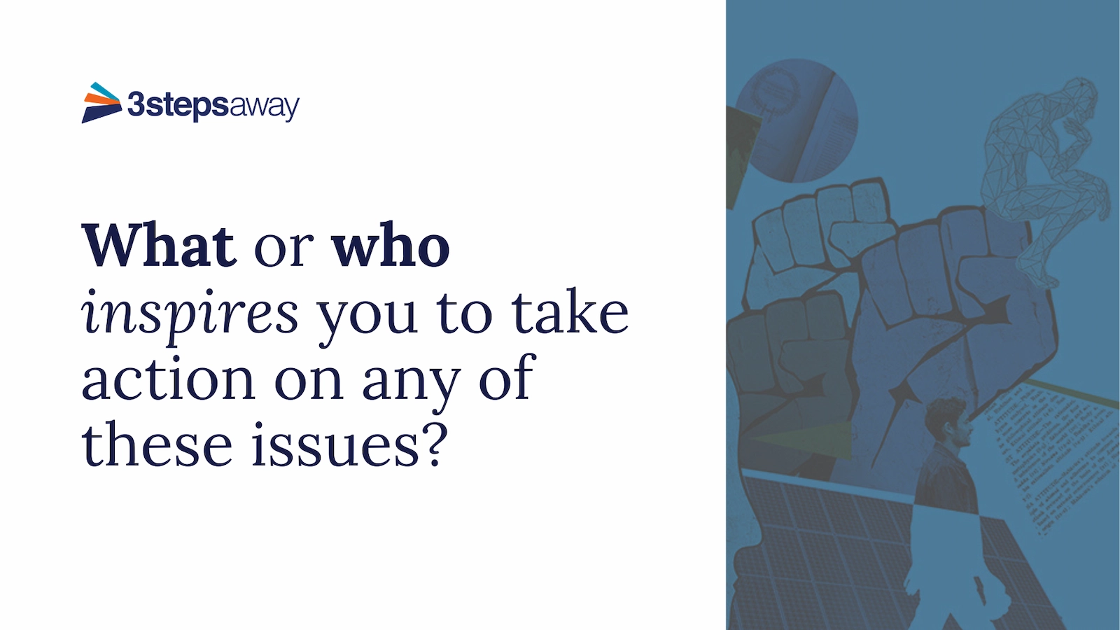
(Click images to enlarge)
These slides show how flexible the identity is in a learning setting, switching between bold title cards and focused content slides. We used the brand’s deep indigo as a background to mark active learning moments, and worked the collage artwork in as subtle overlays and silhouettes, so it stays visually consistent without pulling attention away from the lesson.
Social media content
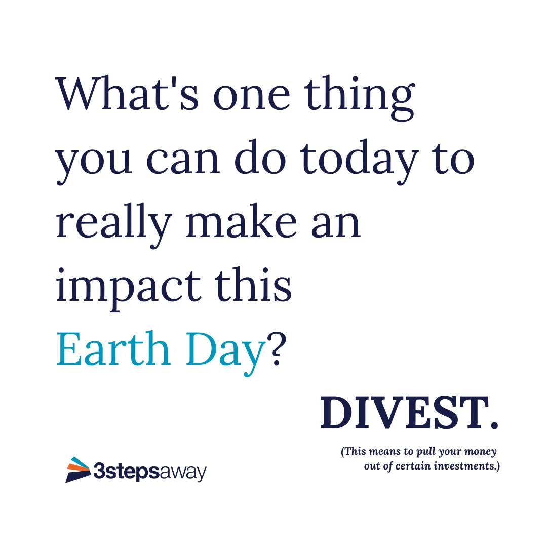
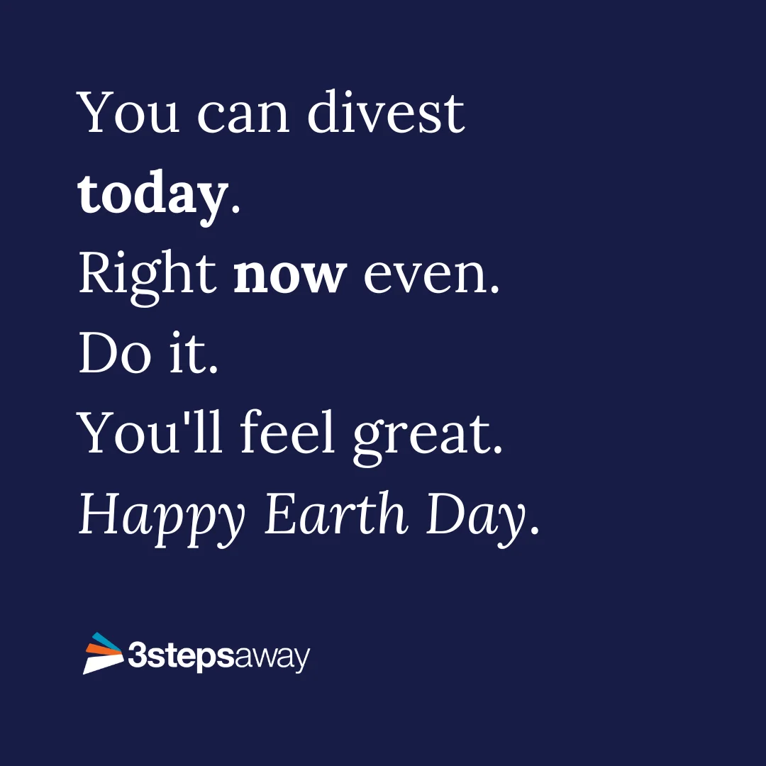
(Click images to enlarge)
For social media, we stripped everything back to focus on the type and the urgency of the message. Switching between the brand’s deep indigo and crisp white gives the posts a high-contrast rhythm that keeps the call to action front and center in a busy feed.
A scalable toolkit for changemakers
From the timing of the logo’s sound to the urgency of the social media type, the 3 Steps Away identity shows a brand can hold firm on its values and still flex to fit wherever it’s used.
Building the whole system around ‘See, Think, Act’ gave us a design language that scales. It makes complex information simpler for course students and still stops a scrolling audience in their tracks.
What we ended up with is one connected toolkit, not just a pile of assets. It lets the brand speak clearly and keeps the call to action from getting lost in the noise.
Results & impact
Key metrics
- 150 students enrolled across 3 partner schools
- 97% completion rate (145 students completed all 4 weeks)
- 4-week program duration with 90-minute weekly sessions
- High engagement: Average 45+ posts per cohort in social platform
Learning design impact
Framework adoption:
Teachers told us they kept using See-Think-Act after our program ended. Students carried it into other subjects and even life decisions. It became a thinking tool they could take anywhere.
Student agency:
In post-program surveys, students said they felt “more capable of making a difference” and “less overwhelmed by big problems.” The framework gave them a process, not just facts.
Visual identity effectiveness:
The brand stuck. Students talked about “3 Steps” as its own thing, not just another school program. The professional design told them it was credible and worth taking seriously.
Key takeaways
-
Visual identity is teaching. The brand wasn’t decoration. It told students this experience was different from normal school content. The professional design said, “Your learning matters, and we took this seriously.”
-
Talking it through beats taking it in alone. Choosing live cohorts over self-paced content was the most important call we made when we moved to remote learning. Complex issues need discussion, not just information handed over. Students had to talk their thinking through with peers.
-
Frameworks prevent overwhelm. See-Think-Act gave students a process for any complex issue. That structure lowered the mental load and kept them from freezing up in the face of huge problems.
-
Service learning theory works. Pairing critical thinking (Think) with hands-on action (Act) taught more than either could on its own. Students remembered the concepts better when they designed and ran their own responses.
-
Simplify without oversimplifying. The hard part was keeping the nuance while making the content easy to get into. See-Think-Act held onto the complexity (multiple perspectives, trade-offs) and still gave students a clear structure.
-
Building a startup teaches you to iterate. Founding a company meant prototyping constantly. We switched from in-person to remote, and from self-paced to live, because we stayed focused on the learning goals instead of defending our original plan. It taught me to care more about learning outcomes than about any particular format.
Reflection: How this shaped my practice
This project was formative for how I approach learning design today:
Visual design as instructional strategy: I learned that how something looks isn’t superficial. Good design signals value, makes people feel safe, and lowers mental load. Every portfolio piece I build now gets as much care on visual hierarchy as on the content itself.
The power of frameworks: See-Think-Act taught me that giving learners a process is often worth more than giving them information. That still shapes how I design AI learning tools. I focus on helping people think, not just delivering content.
Social learning is irreplaceable: Even as I build AI tools, I hold onto this. Some learning needs human connection. My current work looks at how AI can support peer learning rather than replace it.
Iteration over perfection: Rebuilding our whole delivery model during the pandemic, dropping in-person programs for remote cohorts, taught me to hold my designs loosely and put learning outcomes first. That mindset serves me well in fast-moving tech.